charity: water
The Spring: Monthly Giving
The Project
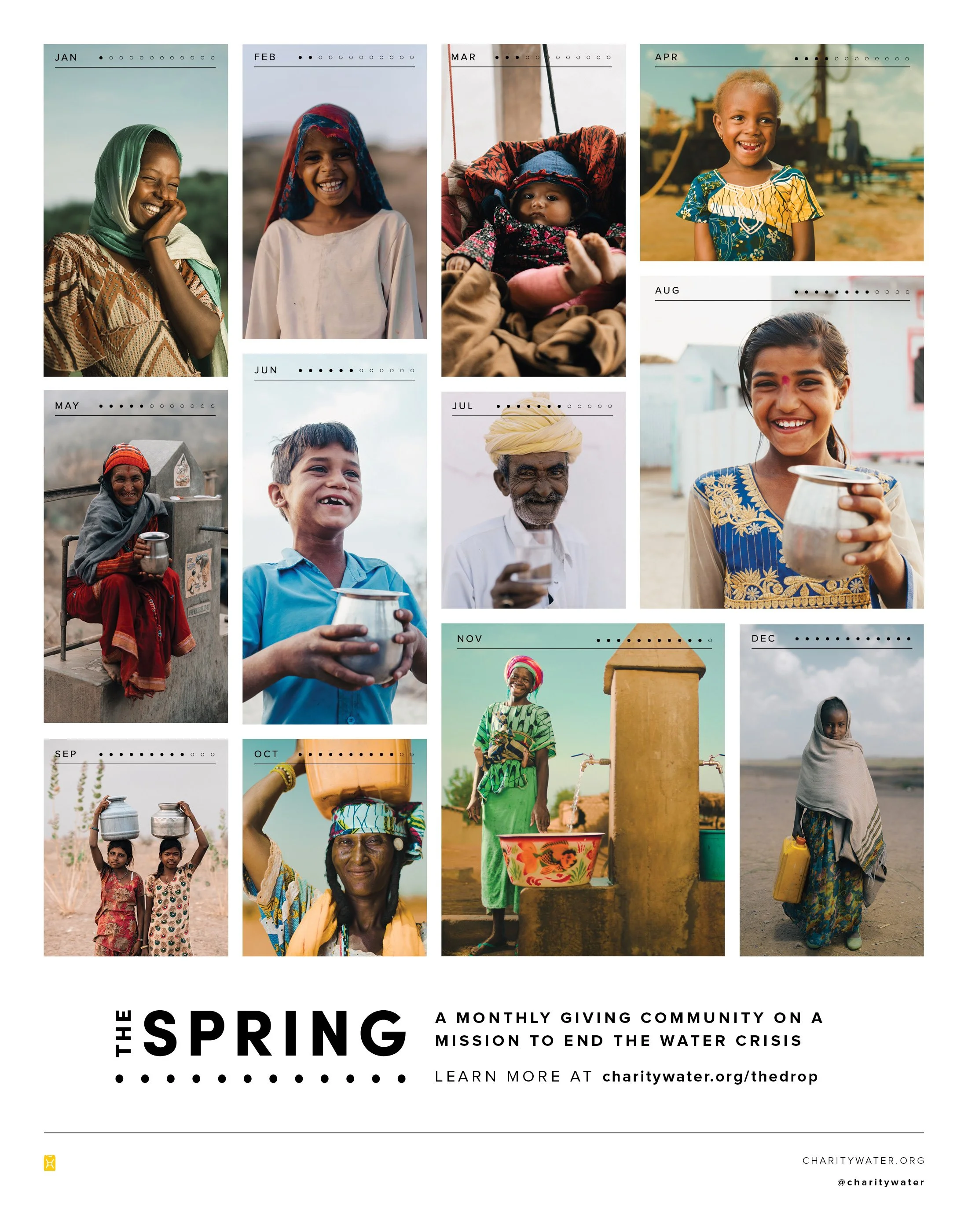
charity: water’s monthly giving platform, The Spring, required a new brand that better encompassed the nature of the program –a community of like-minded individuals working towards a common goal, optimistic that their impact no matter how small makes a difference.
Role + Responsibilities
Lead Designer
Concepts + Visual Identity, Directions for Assets, Expanded Identity for The Journey + Good News, Misc. Marketing Materials
You can learn more about The Spring here.
Branding
RECURRING | COMMUNITY | COLLECTIVE | HOPEFUL | BRIGHT
The branding direction for The Spring takes a minimal, graphic approach focusing on simplicity. Inspired by the recurring nature of the platform, each circular element incorporates 12 (or a multiple of 12) dots as a more literal representation of “monthly giving,” while the circle shape represents repetition and community – the collective effort of many. Keeping with the minimal approach, this color palette utilizes only a few colors but has a vibrant, hopeful aesthetic. Each color has a pair that layers well, allowing for both high contrast and soft contrast layouts.


Content Series
The Spring had two content series within the membership – The Journey, a member-exclusive video series focused on countries charity: water works in, and Good News the monthly subscription newsletter that shared updates from the organization, stories from the community and more. As part of The Spring, the look and feel needed to be rethought in the style of the new brand.


Content © charity: water 2019; Photography ©Jeremy Snell


